See previous article http://onlybook.es/blog/las-obras-de-frank-lloyd-wright-parte-9-casa-bach-y-the-illinois/
«This translation from Spanish (the original text) to English is not professional. I used Google Translate, so there may be linguistic errors that I ask you to overlook. I have often been asked to share my texts in English, which is why I decided to try. I appreciate your patience, and if you see anything that can be improved and would like to let me know, I would be grateful. In the meantime, with all its imperfections, here are the lines I have written». Hugo Kliczkowski Juritz
H. Allen Brooks. «Wright and the destruction of the box.» 1990 (original text from 1979)
The invisible corners
There are many writings by Wright about “the destruction of the box,” in his search for open, fluid spaces.
By the end of the 1880s, the strong ideas of “Shingle Style” or “Queen Anne” (1) had been exhausted, but Wright knew how to draw ideas to generate the use of generous intermediate spaces between main spaces. (2)
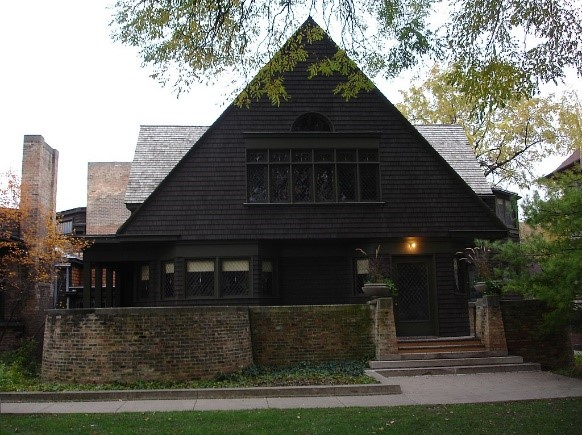
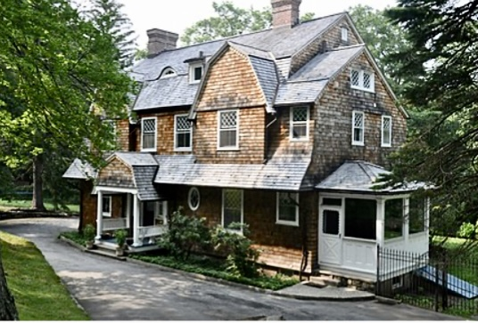
Inside, the traditional house had one box next to another, the sum of a series of boxes of this type resulted in a house. He shared concepts with Bruce Price in his 1897 project of the Kent House at 18 Pepperidge Road, in Tuxedo Park (Dutch Colonial style), especially in the resolution of cruciform floor plans.
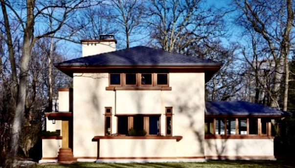
Wright redefined the concept of interior space by dismantling the traditional box. Already in 1902 he approached the resolution of the problem at the Ross House. It was one of the first houses on the Prairie.
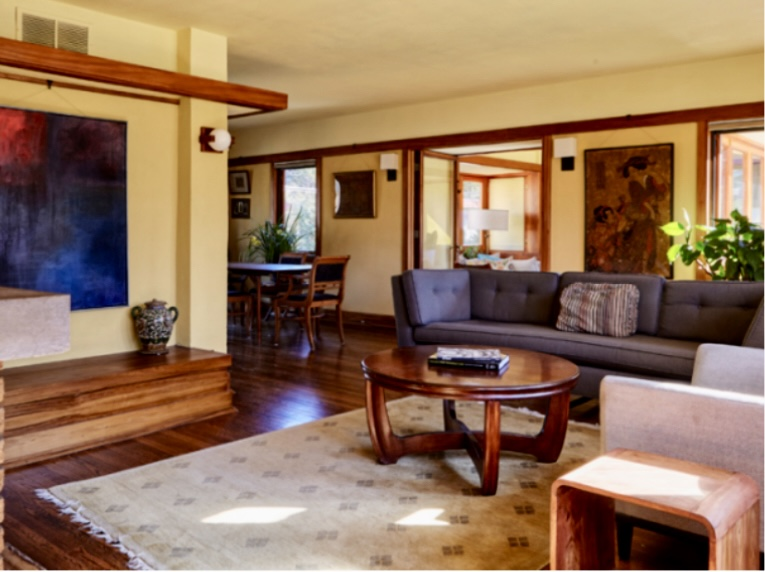
Bruce Price (3) not only influenced Wright, he also influenced other young architects. Wright, in his search for his own language, discovered that to advance in the conceptualization of what he wanted to achieve with his designs, he had to solve the corner. His conclusion was that the point of greatest resistance in a home was the corner. His solution was to dissolve it, by allowing one piece (or space) to penetrate into the other.
It thus creates an overlapping area that serves as a connection between the pieces, as it proposes various uses for the “now” single space, reducing dimensions and cost, without making it appear smaller spatially.
In the words of architectural historian and professor at the University of Toronto H. Allen Brooks (1925 – 2010) (4) “This, when explained, is a simple idea (most great ideas are simple), but in its ultimate consequences is one of the most important discoveries ever made in architecture”.
Wright’s works propose a space that acquires a relative value (it is not fixed), since it influences the observation of an empirical space, where the participation and reality of people’s observation of the space is changing. Spatial perception is varied, it is diagonal, and not frontal, so it changes a lot with movement.
Wright broke away from interior corners as well as exterior corners, and created “invisible corners” with glass angles, this became one of the achievements of the modern movement. When the eye travels along the side wall, it does not find any interruption in the corner, but rather passes outside through the doors.
The boxes have an upper face and a lower face, as well as side faces, and from the Ross House, Wright began to manipulate the height of the ceiling, adapting it to the activities that took place below it, highest where we stand in the room from being near the fireplace or walking along the windows on the exterior walls, and lower down in the dining room, places where we normally sit, places for reflection and conversation.
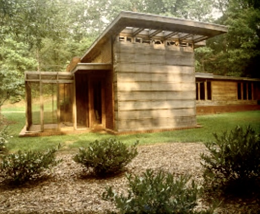
In the Loren B. Pope House, Mt Vernon from 1939, Wright made two levels of ceiling, upon entering some steps allow descent and simultaneously the ceiling is raised in correspondence with the activities to be carried out standing in the living area. The ceiling lowers in the dining room and in the windows where you sit.
If we talk about the “sense of shelter”, the exterior, perforated, and openwork walls lose their closing function and it is in the roof where the “sense of protection” resides. It exchanges roles by going from an architecture of walls to an architecture of ceilings, which it achieves with the skillful management of their heights.
But it was not understood as something desirable, Mr. Moore, a resident of Oak Park, demanded “We want you to build our house, but I do not want you to present us with anything that reminds us, in the least, of Mr. Winslow’s“.. «I wouldn’t like to have to take the train in the morning through small alleys, to avoid being laughed at“.
In his autobiography Wright says “…It was the last time I considered my status as a family man with three children to feed…”
It was not so, on Christmas 1922, a fire destroyed part of the Moore house, and Wright, renouncing his principles, carried out another project in 1923.
It is said that the term «Prairie School» is attributed to the historian Brooks. In March 1908, Wright in the magazine Architectural record defined: «… we live on the prairie. The meadow has a very characteristic beauty. We must recognize and accentuate this natural beauty, its tranquil expanse. Hence the gently sloping roofs, the small proportions, the peaceful silhouettes, the massive chimneys, the protective eaves, the low terraces and the advanced walls, which limit small gardens…”
It introduced a sense of mystery into the spatial sequence.
In a first step, Wright eliminates the corners, and transforms the walls into sheets, free and mobile. In a second step, through the assembly of segments of the sheets, it forms spaces, creating a new spatial context that integrates the functions that previously made up the destroyed pieces
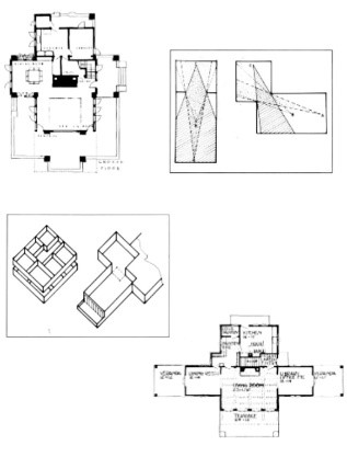
In the drawings on the left, a typical Shingle Style plant, with large openings between room pieces main, right, in a Wright house one piece penetrates the other at the corners. In the following drawing you can see the resolution of the plants, the dimensions of the pieces in these two plants are identical.
They are not «uncontrolled openings of spaces», they use different procedures such as in the Willits House with vertical sheets of wood combined with low shelves for books, or walls that do not reach the ceiling (Roberts and Hanna houses -1935/7) (5), homes and chimneys that open onto the neighboring space (Martin and Robie houses).
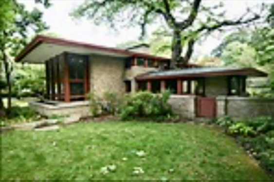
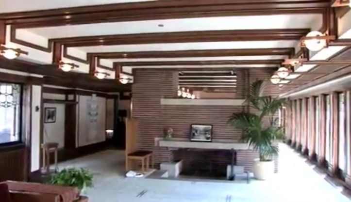
Wright had a three-dimensional way of thinking, which is verifiable in the frequency with which he so often brings together ceiling and walls with simple resources, many of which can be seen in the Robie house. Spatially, Wright dissolves the corner and makes it transparent, the corner glasses meet butt, they do not have frames or opaque materials.
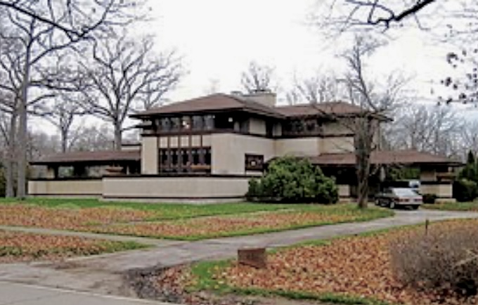
In the case of the Willits house, the core that articulates the ground floor is formed by the fireplace and two continuous benches. This cross arrangement allows for many views, but restricts a total view of the space, which forces the visitor to the house to walk through it. The dining room and living room share exterior walls, but the “wall” that separates the two pieces is a free-standing fireplace. The flues move to the sides and make possible a large opening in the mass of the chimney at roof level.
From each of the pieces you can see the ceiling of the other, which increases the feeling of space without decreasing privacy, and you have a continuous perspective on the side walls of these two connected pieces. Due to the absence of corners (there are no visual cues to stop us) it is impossible to say where those exterior walls end, or when they stop belonging to the space where we are; The resource works, no visual break, neither outside nor inside, denotes the limits of either of the two spaces.
Wrightian space depends on the location of the observer and not on a predetermined limit. Wright creates a sense of expansion, a visual extension of space that the actual dimensions of his buildings would seem to make impossible. It had amazing effects not only on Wright’s works, but also on the future of architecture.
This release of the walls from their corners turns them into a sheet, and they are no longer in a fixed position, turning from a wall into a sheet. A free and mobile sheet can rotate on its axis, be divided into smaller sheets, into segments of that sheet, assembled with others and define a new spatial concept.
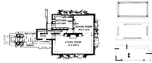
of the Home Journal, in April 1907
In the diagram, a plant appears with its four walls locked in their corners; when these are eliminated, the walls become independent planes or sheets. Rather than enclosing, they define an area that remains similar to that of the traditional scheme, but the exception is in the corners.
An example is the plan of the 1904/6 Darwin D. Martín House in Buffalo, New York, which was widely disseminated in Europe when it was published in the Wasmuth Portfolio in 1910.
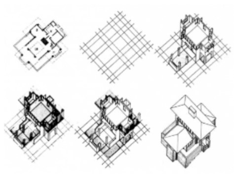
The dimensions and location of the elements that define the spaces, whether screens, sheets, pillars, roofs and chimneys, were never casual or arbitrary, but were controlled and governed by what Wright called “a system of units”.
The floors present a special theme, in Willits House and Davidson House (Prarie houses), a single level change was introduced. It is interesting to see how in the Palmer House, a difference in level of one step is used to discourage the visitor from approaching the bedroom wing, or, as in the Pope House, to magnify the feeling of majesty as one descends from the entrance to the rooms. more public sectors of the house.
Wright managed the scale of the design as well as the proportions, materials, furniture and color, to create as perfect a harmony as possible (many times he achieved total harmony), he did not admit discordant notes.
Unlike other “crutches or aids”, such as the golden section (a/b = b/ [a + b]), or Le Corbusier’s Modulor, Wright never explained how his system worked.
See article http://onlybook.es/blog/el-modulor-de-le-corbusier/
Wright later applied this system to elevations as well. An essential aspect of Wright’s organic architecture is the idea that interior space must find exterior expression.
A comparison between the Willits House (1902) and the Robie House (1908) shows its evolution. . The buildings became more informal, more open, and their relationship with the natural environment is more immediate.
The “Usonian house,” with its modest size, was the perfect expression of all this. The spatial situations inside could be read externally. A masonry wall, closed in a U shape, illuminated internally only by a clerestory window under a low ceiling slab, was a study, a place to retreat; a higher ceiling and a row of glazed French doors signaled a more public living space; smaller windows facing a protected patio corresponded to a bedroom. Space always manifested itself; had been defined, a definition that everyone sees and recognizes.
Reorganizing the home spatially was an arduous intellectual process for Wright.
Traditionally the pieces or rooms are delimited with locked walls in the corners; during the 19th century, English country houses made “ridiculous” use of this spatial segmentation.
Wright recognizes this “problem” and sets about “correcting” it. He detected that the corners were the most expressive element of the problem and decided to solve it.
It dismembered the intermediate walls, the ceilings, and even the floors. Finally, he reassembled the fragmented pieces in a different spatial context. He defined the functions by creating an environment where I will live smaller, but psychologically healthier.
He was a brilliant architect, and he takes the essential step of “destroying the box”. (6)
The system has some structural advantages, overhangs occur naturally when the main structure moves away from the corners.
In a next step Wright would use floor-to-ceiling French doors to achieve the desired effect. Initially, the free-standing fireplace opened on both sides, and the ceiling bands brought together the living room, the fireplace and the entrance hall into a single spatial entity. Unfortunately one side of the chimney has been closed off by the new owners, and the roof bands have been removed.
I recommend reading this article from a collaborator of Wright, until he was invited to retire from Taliesin, in 1948.
His philosophical concepts about the way a city should help the development of life for its inhabitants, and his criticism of F.LL.Wrigh’s concept of urban development in Broadacre City (a project financed by Edgar Kaufmann) confronted him with his teacher.
He began his life project in Arizona.
I have had the opportunity to visit it and discovered that even today ancient artisans and followers of Architect Paolo Soleri still live there:
http://onlybook.es/blog/arq-paolo-soleri-por-hakj/
His project for the new SULIMENE ceramics factory south of Naples (declared an Italian Monument) is very interesting, an organic and expressive work.
Notes
1
It was the rise of the New England school of architecture, which opposed the ornaments of the Eastlake style. The concept was of “mass”, an entire volume, with continuous horizontal lines.
2
H. Allen Brooks. Wright y la destrucción de la caja. 1990 (texto original de 1979)
3 y 4
H. Allen Brooks (1925 – 2010) was an architectural historian and professor on the faculty of the Department of Fine Arts at the University of Toronto. He was the editor of the 32 volume Le Corbusier Archive. He wrote and researched Frank Lloyd Wright and the Prairie School. The term “Prairie School” is attributed to Brooks. His first book «The Prairie School: Frank Lloyd Wright and his Midwest Contemporaries“ (1972), received the Alice Davis Hitchcock Award from the Society of Architectural Historians, as well as the Wright Spirit Award, the highest award given by the Society of Architectural Historians, the Frank Lloyd Wright Building Conservancy. He was president and member of the Society of Architectural Historians, a founding member of the Society for the Study of Architecture in Canada, and a life member of the Society of Architectural Historians of Great Britain.
5
For the young Hanna couple, at 737 Frenchman’s Road, who adapted the house for 25 years. The house is designed in a geometry based on hexagons skillfully innovated by Wright.
6
About the Box, see “An Autobiography”, New York, Duell, Sloan & Pearce, 1943, in the “Building the New House” section.
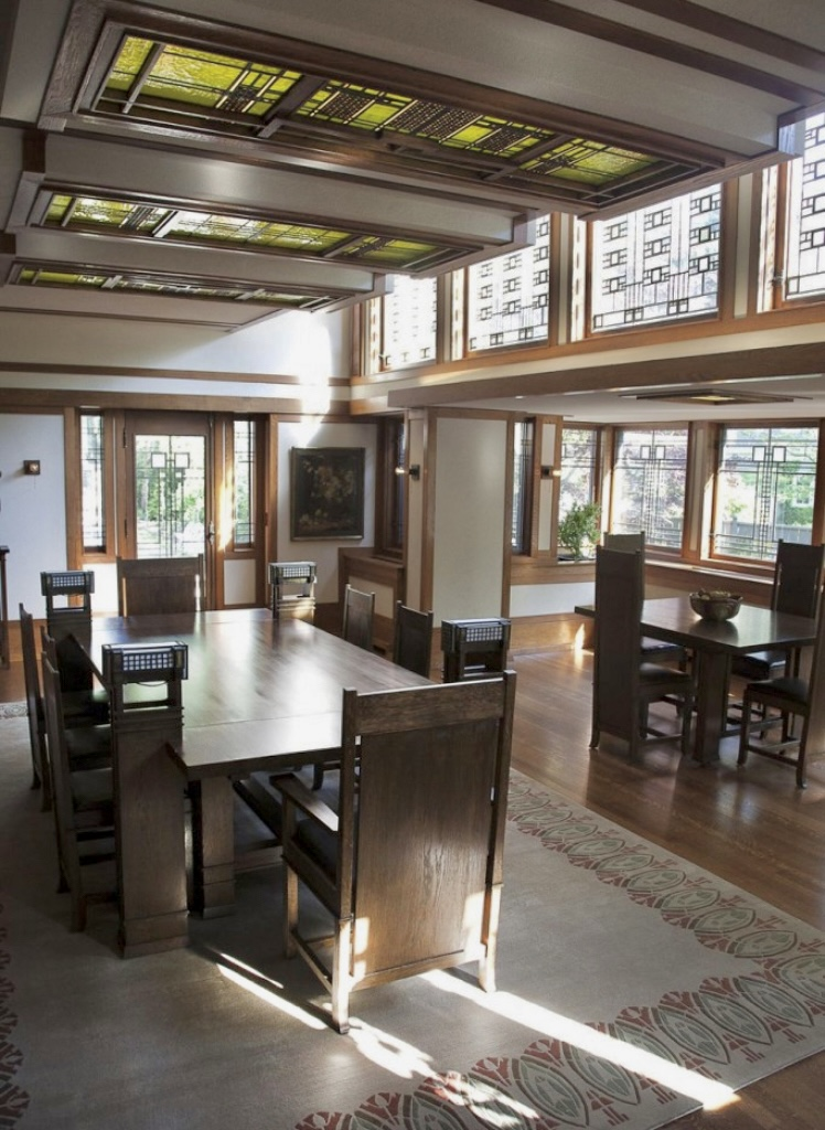
A shining example is the dining room of the Boynton House (1908) in Rochester, where three ceiling heights relate directly to Wright’s furniture, which after seventy years is still (incredibly) in place.
A small table for breakfast or lunch is situated against the outside window; Above it, the ceiling is only head-high and creates a feeling of intimacy at family meals. Towards the interior of the room there is a large and imposing table, flanked by chairs with high backs; It corresponds to formal family gatherings and the reception of guests, and in scale with this the ceiling is higher.
Between these two tables with their ceilings in relation is a clerestory (line of windows, open in the thickness of the walls) on one side that illuminates the main table and gives light to the deepest corners of the room. This one and a half story high ceiling covers the area where one can walk inside the room.
When it came to uniting the interior and exterior space, he created a screen of glass doors between the interior and the terrace, as in the Willits House or other Usonian houses.
Continue at http://onlybook.es/blog/las-obras-de-frank-lloyd-wright-parte-11-libreria-browne/
Our Blog has obtained more than One million readings: http://onlybook.es/blog/nuestro-blog-ha-superado-el-millon-de-lecturas/

Arq. Hugo Alberto Kliczkowski Juritz
Onlybook.es/blog
Hugoklico.blogspot.com

Salvemos al Parador Ariston de su ruina
Let’s save the Parador Ariston from its ruin
http://onlybook.es/blog/el-parador-ariston-una-ruina-moderna-por-hugo-a-kliczkowski/