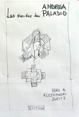
Los sonidos de Andrea Palladio.
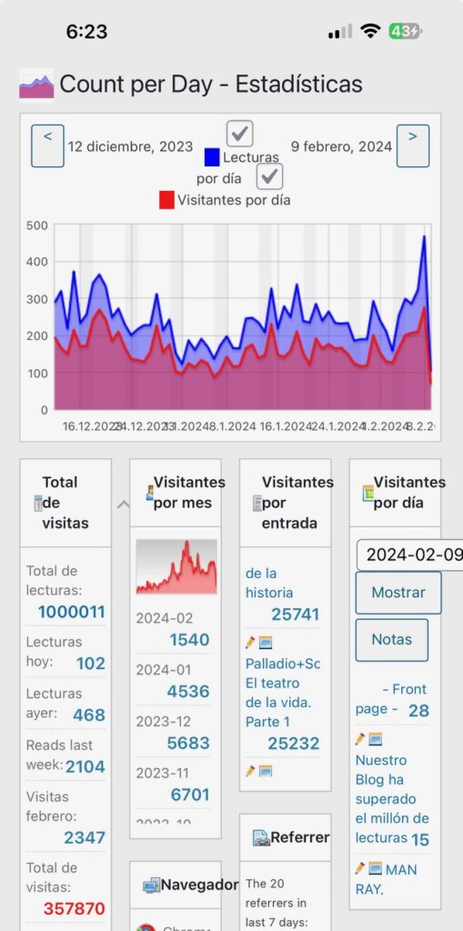
Palladio+Scamozzi. El teatro de la vida. Parte 1
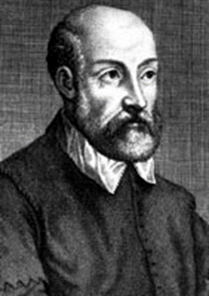
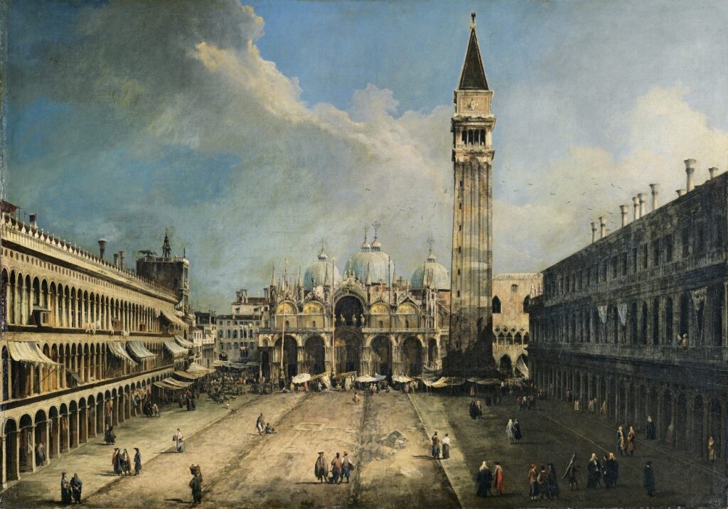
A Pietro de la Góndola, le gustaba caminar por Venecia, antes de llamarse Andrea Palladio, cuando lo hacía por Vicenza.
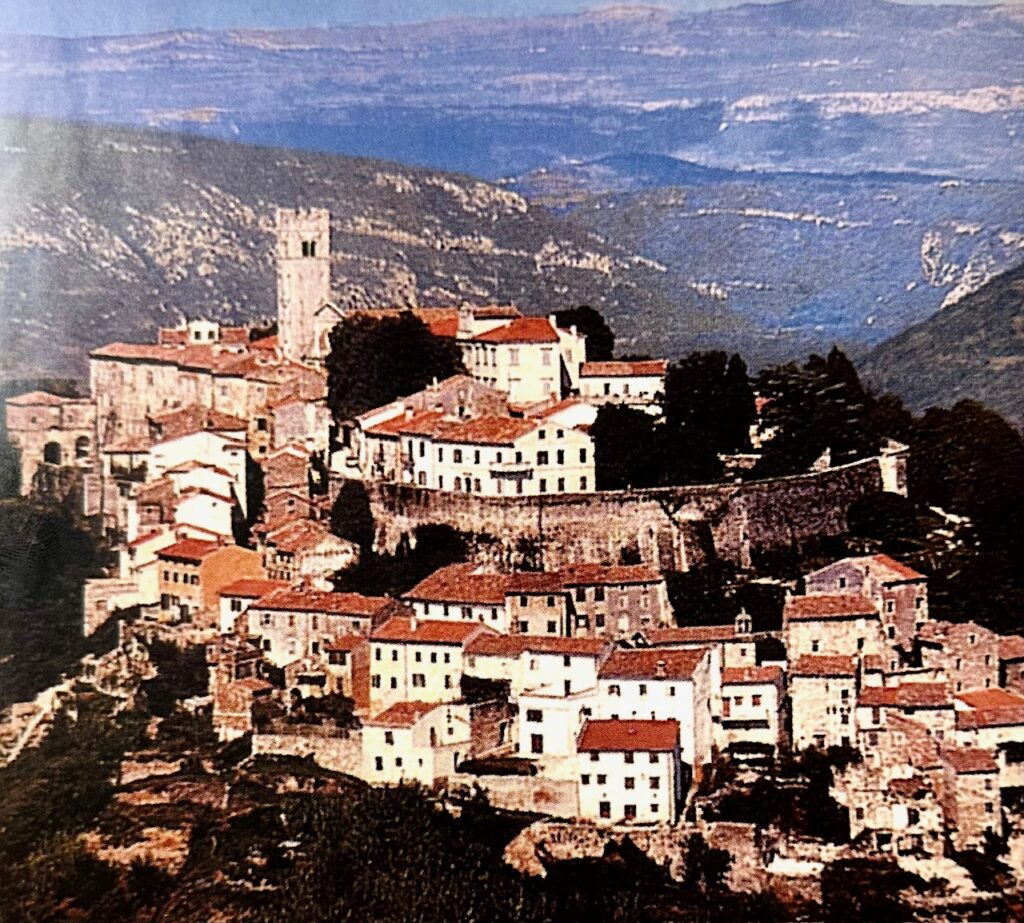
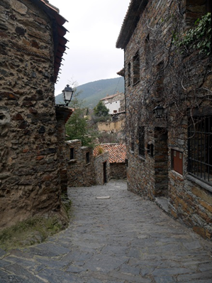
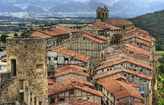
Vicenza era una de las ciudades más antiguas del Véneto, probablemente fundada alrededor del siglo VI AC, por los Euganeos una población local que luego de refugiarse en los valles alpinos, no ha dejado registros relevantes. Como ocurrió con prácticamente todo el Mediterráneo los romanos la ocuparon 3 siglos más tarde. Su economía no cambió durante siglos, trabajaban la tierra, la ganadería y una producción textil, basada en la industria de la lana.
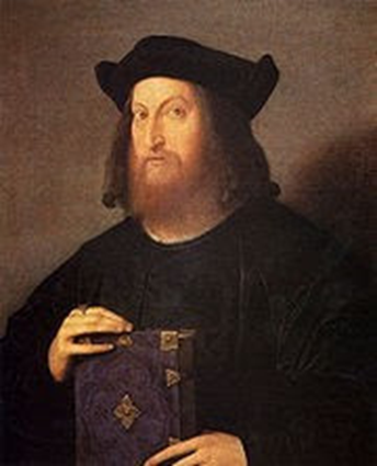
Pietro de la Gongola estudió en Padua junto al arquitecto y pintor Giovanni Maria Falconetto (1468 – 1535), allí no existía una escuela donde pudiera estudiar arquitectura, pero fue un protector, como era frecuente en la época, llamado Giangorgio Trissino (1478 – 1550) (1), quien detecta en él una especial capacidad, que necesita ser desarrollada.
Ya transformado en su protector, decide que su formación será básicamente estudiar a los clásicos.
Es justamente Giangorgio quien, como era habitual en esa época, sugiere un cambio de nombre, Andrea di Pietro de la Góndola es bautizado por Trissino como Andrea Palladio.
El apellido Palladio podría venir de Palas Atenea o de un personaje de los poemas de Trissino que denominó Palladio, era experto en arquitectura.
Decir estudios clásicos, es decir Roma, adonde viajan varias veces juntos, son 5 viajes, Andrea tiene 33 años, Giangorgio 63 cuando realizan el primero, el segundo en 1541, luego 1545. 1547 hasta 1551.
Uno de ellos duró 5 meses. El objetivo de estudiar los clásicos era comprenderlos en su esencia, verlos, oírlos, olfatearlos, medirlos “con la palma de la mano”. Una nueva estética para una Vicenza que, de acuerdo con el pensamiento de Giangorgio deberíoa diferenciarse de la estética de “La Serenísima”.
Era normal pues que, siendo Venecia la sede de un príncipe reinante, fuese llamada Serenissima. El título ya se utilizaba mientras Venecia estuvo bajo la influencia bizantina, que lo ostentaban los príncipes en Bizancio, pero, en la ciudad, cobró importancia tras independizarse de Constantinopla. Procuraban vivir una Pax Serenísima.
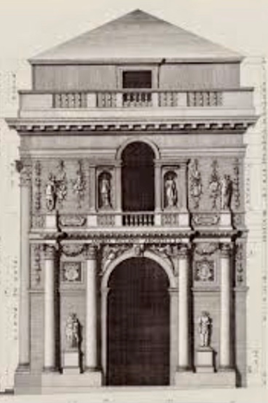
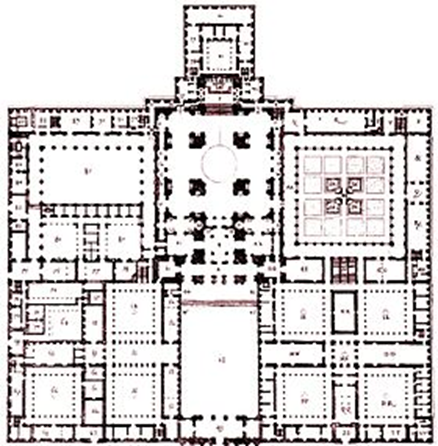
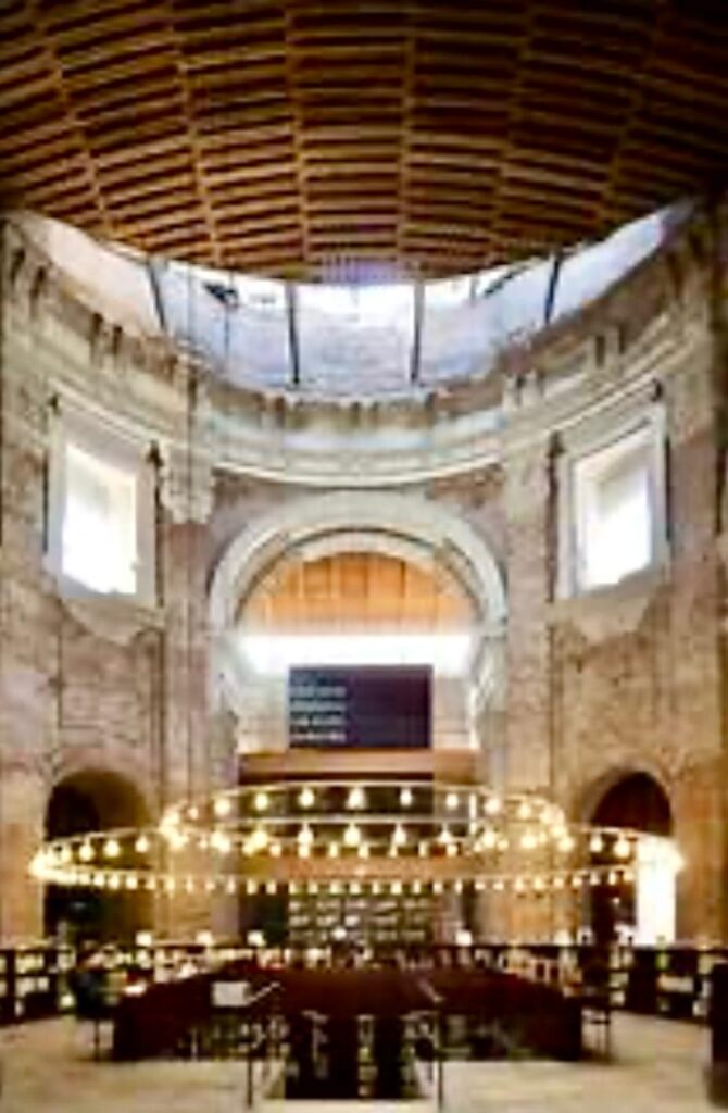
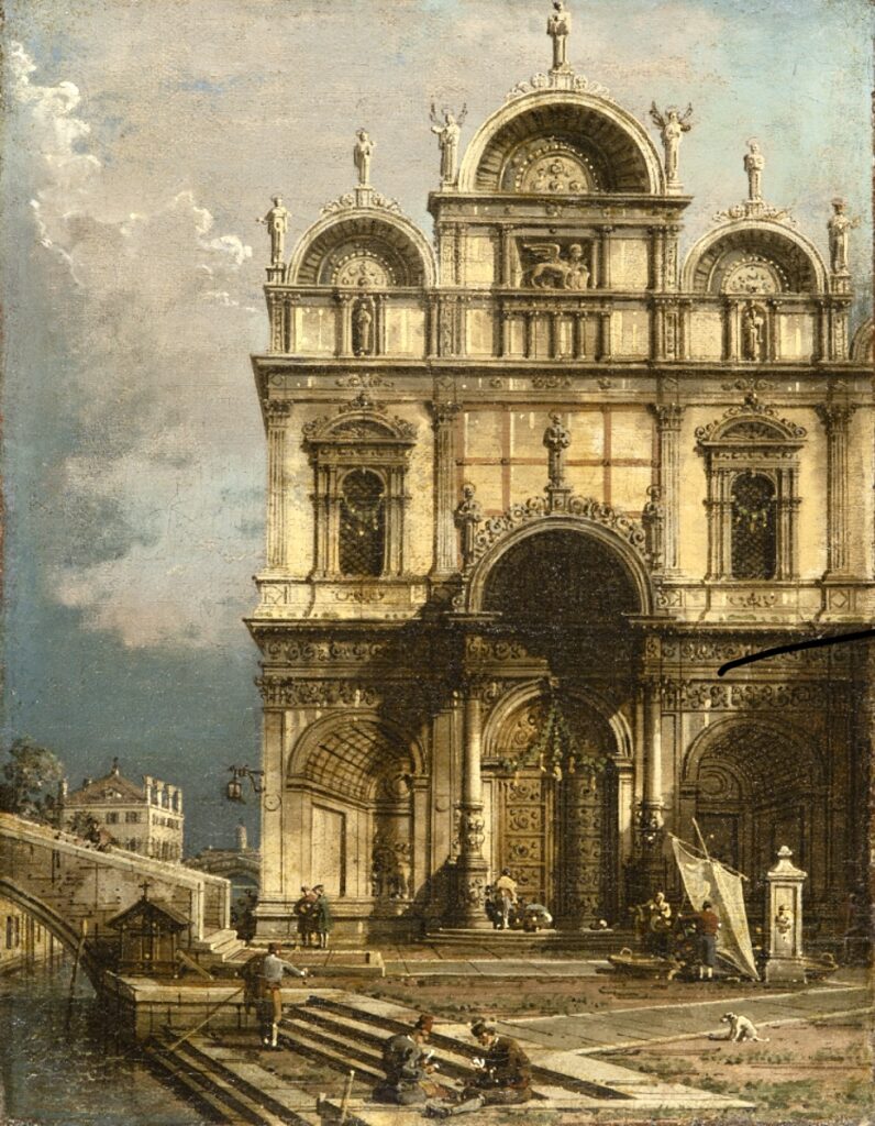
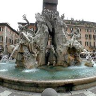
El Panteon
El Panteón sería el modelo y el concepto por seguir.
Tomó muchos apuntes, no sólo de las ruinas romanas sino también de las obras de Bramante (C. 1443 ó 1444 – 1513), llamado también Donato di Pascuccio d’Antonio algunos de los cuales fueron recogidos en sus “quattro libri dell’Architettura”, obra publicada cuando tenía 62 años, y por la que se le ha relacionado con Leon Battista Alberti (1404 – 1472).
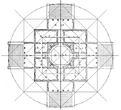
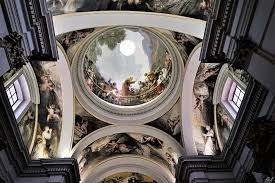
Descubren que en el diseño del Panteón no se dejó nada librado al azar. El todo y sus partes definen un sentido, fueron a descubrirlo y a aprender el porque de ese sentido, de las proporciones del edificio, de su orientación, del estilo de su ornamentación que es una sutil y fascinante decoración. La esfera, el óculo, elemento central define a este faro cósmico diseñado para conectar el mundo terrestre con la morada de los dioses celestes.
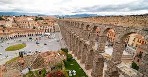
El Panteón de Agripa, o Panteón de Roma, es una de las obras maestras de la arquitectura presentes en la capital italiana además de ser el edificio mejor conservado de la antigua Roma.
La construcción del Panteón se realizó en el tiempo de Adriano, en el año 126 d.C. Recibe el nombre de Agripa por haber sido construido donde anteriormente, en el año 27 a.C, se encontraba el Panteón de Agripa destruido por un incendio en el año 80 d.C. Durante los inicios del siglo VII el edificio fue donado al Papa Bonifacio IV quien lo transformó en una iglesia conservándose por ello hasta hoy en día en perfecto estado.
La fachada rectangular, oculta una enorme cúpula con un diámetro mayor al de la Basílica de San Pedro. Está compuesta por 16 columnas de granito de 14 metros de altura, sobre las que se lee la inscripción «M.AGRIPPA.L.F.COS.TERTIVM.FECIT», que significa «Marco Agrippa, hijo de Lucio, cónsul por tercera vez, lo construyó«.
El Panteón, es una perfecta síntesis de armonía e inteligencia constructiva y nadie se atrevió a realizar una obra similar sino hasta el Renacimiento, catorce siglos más tarde. Miguel Ángel se refirió al Panteón como el edificio que tenía «un diseño angélico y no humano».
En la actualidad, este edificio aun conserva su pavimento original de mármol y en las capillas interiores, donde antiguamente se encontraban las estatuas de las divinidades, hoy se encuentran capillas con numerosas obras de arte. Desde el período del Renacimiento, el Panteón ha sido utilizado como sede de la Academia de los Virtuosos de Roma sirviendo de sepulcro a grandes italianos como Rafael de Urbino y los reyes Vittorio Emanuele II, su hijo Umberto I y su esposa Margherita.
La cúpula tiene un diámetro de 43,44 mts, igual a su altura interior de piso a techo, pesa 4.535 toneladas, y lo realizaron sin armadura de acero en su interior. Para aligerar el peso de la enorme semiesfera se optó por cambiar el travertino (la piedra con la que se ha construido prácticamente toda Roma) por una mezcla de piedra pómez y tufo –piedras volcánicas muy porosas- y estrechar el grosor de los muros según se asciende (5,9 metros en la base y sólo 1,5 en el borde del óculo) para luego cubrir el exterior con un hormigón a base de cenizas volcánicas.
Apolodoro de Damasco utilizó el diseño y las técnicas de construcción para hacer más fuerte el cilindro sin necesidad de construir grandes contrafuertes en el exterior (como en los grandes edificios bizantinos como Santa Sofía). La solución fue hacer siete ábsides interiores que crean una superficie con aristas que ayuden a repartir el peso en puntos específicos del suelo. Para hacer los muros alternó ladrillo (creando un esqueleto de arcos y contra arcos que van repartiendo el peso de la cúpula) y hormigón para crear un tambor sólido pero delicado.
El Óculo tiene un diámerto de 9 metros, está permanentemente abierto para dejar pasar la luz y el agua de lluvia, por ello el pavimento de la sala circular es ligeramente curvo, unos 30 cm para conducir la lluvia hacia los canales de desague que estan en todo su perimetro, la forma especial del Óculo crea una corriente de aire ascendente que desmaterializa el agua de lluvia, durante las tormentas copiosas entra un rocio que se filtra por los 22 pequeños agujeros que hay en el suelo.
La cúpula da sentido al edificio y su planta circular es su mayor desafío. Para aligerar el peso de la enorme semiesfera se optó por cambiar el travertino (la piedra con la que se ha construido prácticamente toda Roma) por una mezcla de piedra pómez y tufo –piedras volcánicas muy porosas- y estrechar el grosor de los muros según se asciende (5,9 metros en la base y sólo 1,5 en el borde del óculo) para luego cubrir el exterior con un hormigón a base de cenizas volcánicas. Apolodoro de Damasco utilizó el diseño y las técnicas de construcción para hacer más fuerte el cilindro sin necesidad de construir grandes contrafuertes en el exterior (como sucede, por ejemplo, en los grandes edificios bizantinos como Santa Sofía). La solución fue hacer ábsides interiores que crean una superficie con aristas que ayuda a repartir el peso en puntos específicos del suelo. Para hacer los muros alternó ladrillo (creando un esqueleto de arcos y contra arcos que van repartiendo el peso de la cúpula) y hormigón para crear un tambor sólido y al tiempo ligro y armónico.
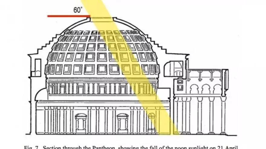
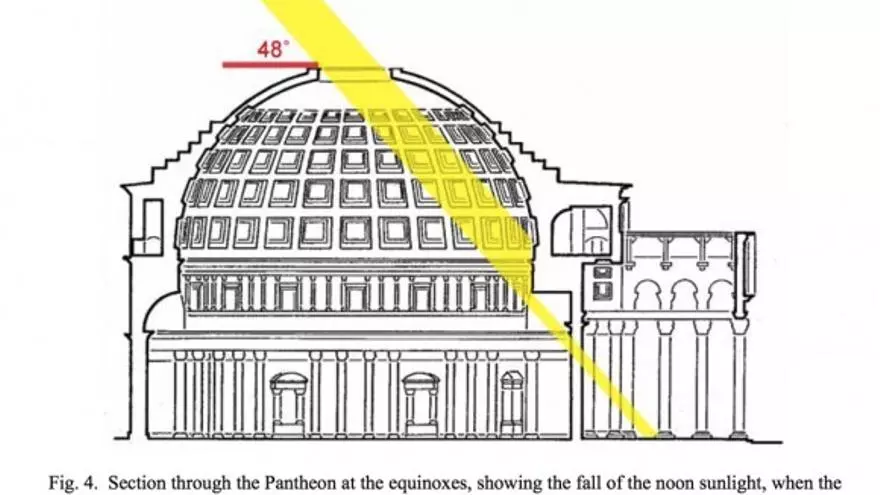
La orientación del edificio es una muestra de la pericia romana a la hora de diseñar con sentido simbólico. La puerta del edificio se orienta hacia el norte y el Óculo está especialmente diseñado para que la luz solar entre en el edificio e ilumine el suelo en los equinoccios de Primavera y Otoño. El haz de luz solar del medio día ilumina la entrada cada 21 de abril, día de la fundación de Roma, recorriendo el suelo del templo hasta que lo deja el 20 de agosto. Luego habita en las alturas de la cúpula hasta la llegada de una nueva Primavera.
El Panteon ámbito divino pra recibir a los diosoes, se reconstruye en el mismo lugar en el que en el año 27 d.C. se encontraba el anterior Panteon erigido por Marco Agrippa, debido a que en el 80 d.C. un incendio lo destruyó. Su reconstrución se realizó en tiempos de Adriano en el 126 d,C, Fue donado al Papa Bonifacio IV que lo transformó en Iglesia, una motivo impotante con el cuidado que ha facilirado estar mas de 20 siglos despues en un excelente estado. Aun cuando el Panteón es un monumento histórico, sigue siendo en la actualidad una iglesia en la cual se celebran misas y especialmente matrimonios.
El Panteón está dedicado a los siete dioses celestes de la mitología romana: el Sol; la Luna; Marte; Mercurio; Venus, Júpiter y Saturno.
Una arquitectura de película (2)
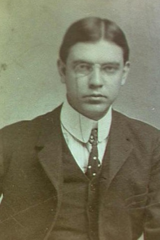
El director de cine Giacomo Gatti (3) comenzó hace 6 años, el rodaje de un documental dedicado a Andrea di Pietro della Gondola, que denominó “Arquitecto Vicentino”.
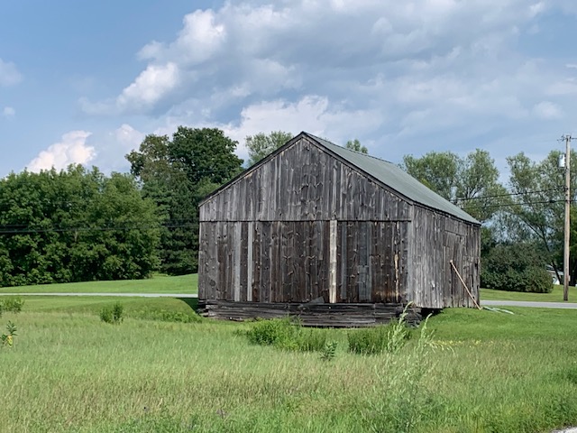
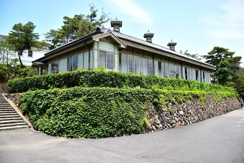
Es en Vicenza donde Palladio construyó 23 monumentos (palacios, edificios civiles y religiosos) y 16 villas en el territorio provincial.
Rescata el llamado “Palladianismo”, difundido en Europa gracias al arq ingles Iñigo Jones (1573 – 1652) y Thomas Jefferson (1743 – 1826) tercer presidente de los Estados Unidos.
Iñigo Jones fue respetado por emplear las reglas de proporción y simetrías difundidas enciclopédicamente por Vitruvio.
Kent. Reino Unido
Reconocidas son sus obras Banqueting House en Whitehall, el diseño de la plaza del Covent Garden. Tuvo gran influencia en los arquitectos del siglo XVIII difundiendo el “palladianismo inglés”.
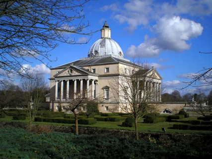
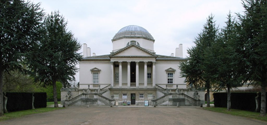
Podemos agregar que hubo ejemplos referenciales como el castillo de Mereworth en el condado de Kent (1723/25) así como la obra de Lord Burlington (1694-1720) con Chiswick House en Londres.
Recuerdo haber escuchado que era “grande para usar de llavero, y muy pequeña para vivir”. Esta en las afueras de Londres cerca de la autopista para salir de la ciudad.
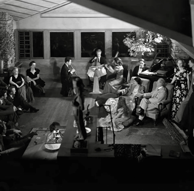
El punto de salida lo marca la escena que reúne en la Villa Saraceno a los “palladianos” actuales, propietarios y residentes de las villas (como los condes Antonio Foscari y Nicoló Valmarana y Cristian Malinverni), expertos, estudiosos y restauradores en un fructífero diálogo durante un banquete, tratando de captar al máximo el universo antiguo y moderno de Palladio.
El film de Gatti consigue explorar el impacto del arquitecto, el estreno fue el 20 de mayo de 2019 en Italia. El cineasta adopta un enfoque itinerante y no lineal, la película de 97 minutos, Palladio: The Power of Architecture, presenta a personas como el historiador y político Lionello Puppi (1931 – 2018), el arquitecto y escritor Kenneth Frampton (1930), el artista George Saumarez Smith o al arquitecto Peter Eisenman (1932) que reflexionan sobre su influencia histórica y su papel en la imaginación arquitectónica mundial.
La película se filmó en Estados Unidos y Europa, con estudiantes y académicos de Yale y Columbia, mientras hablan se intercalan imágenes de la Villa Foscari (La Malcontenta), Villa Capra (La Rotonda) entre otros lugares de Italia.
Palladio fue declarado “el Padre de la arquitectura estadounidense” por el Congreso en el 2010. La Rotonda fue inspiradora de la Villa de Monticello (residencia de Jefferson), una Villa que pude recorrer y de la Universidad de Virginia.
Motovum
He visitado la Villa Foscari, que tan bellamente muestra su mejor cara al canal Brenta.
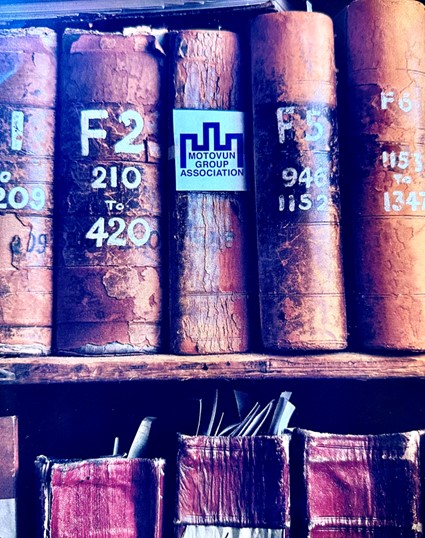
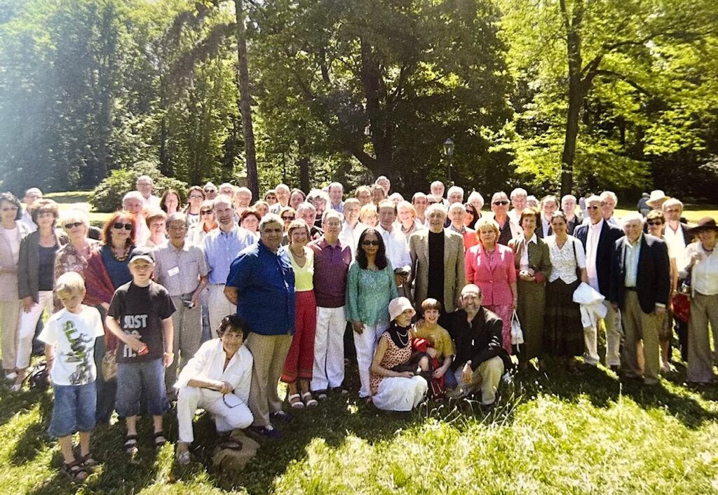
Fui luego de una Feria del libro de Frankfurt junto al grupo de editores “Motovum” (4), del cual era miembro permanente desde el 2002.
En el 2012, magicamente consiguieron la invitación para que podamos visitar la Malcontenta.
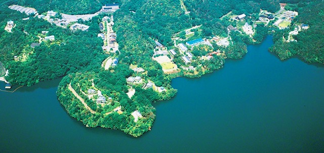
El grupo lleva el nombre de la ciudad Croata Motovum, ésta quedó, en muchos sentidos marcada por la dominación veneciana.
Pude saber que allí se encuentra el León de San Marcos, el más antiguo de todos, al que llaman León de Venecia, una antigua escultura en bronce de un león alado que está situada en la Plaza de San Marcos en Venecia, desde el siglo XII, es su símbolo.
Tenía unos hermosos robledales, de los que ahora solo quedan menos de 10 hectáreas, ya que la tala masiva para abastecer de madera a Venecia y construír las viviendas sobre pilotes, fue una perdida ecológica, inmensa.
Es propiedad de la familia Foscari, perteneciendo actualmente al arquitecto Conde Antonio Foscari Widmann Rezzonico, responsable de la reciente restauración de la villa, y uno de los arquitectos responsables de la restauración del Palacio Grassi en Venecia.
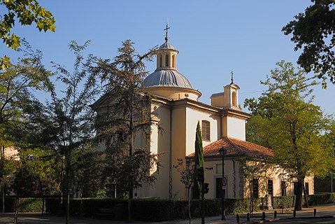
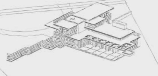
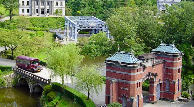
La Villa Foscari, llamada “La Malcontenta”, es una villa del siglo XVI realizada por Andrea Palladio. Se encuentra en el municipio italiano de Mira, cerca de Venecia. Según la leyenda, el nombre de La Malcontenta se debe a la noble dama Isabel Delfín, esposa de Nicolás Foscari, fue confinada a la villa porque, se alegaba que no cumplía su deber conyugal, y en los salones del patriciado culpaban del hecho a un presunto amorío de la aristócrata con el Dogo de Venecia. Otra leyenda dice que en 1431 ya se llamaba asi, para recordar el descontento de los habitantes de Padua y Piove di Sacco por la construcción del Naviglio del Brenta. Éste era un canal que une la ciudad de Padua con Trento pasando por Bassano del Grappa (donde está el increíble puente de madera de Palladio que he visitado y menciono más adelante).
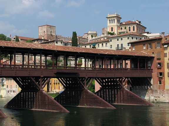
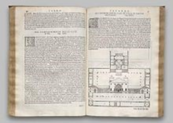
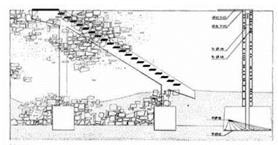
Antiguo puente de madera que cruza el río Brenta, documentado el original porel cronista medieval Gerardo Mauricio (c. 1173/76 – 1237) el puente actual es un diseño de Andrea Palladio de 1569.
El puente preexistente de 1209 al 1569 era una estructura de madera sobre pilotes cubierto, via de comunicación entre Bassano y Vicenza. El dibujo es el puente que aparece en el libro III de los Cuatro libros de la arquitectura es de 1570.
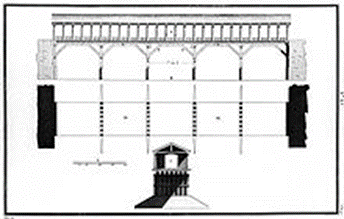
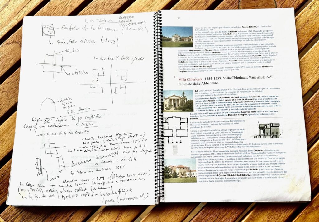
Hay muchos dibujos de obras de Palladio realizados por Ottavio Bertotti Scamozzi. (5)
En 1567 una inundacion del río Brenta destruyó el histórico puente existente. Requerido Palladio, presentó un puente de piedra con tres arcos siguiendo el modelo de los antiguos puentes romanos, que fue rechazado por el Concejo de la ciudad, su segundo proyecto fue un puente de madera que rememoraba la estructura del anterior, aunque renovada en sus soluciones tecnicas y estructuralres. La cubierta esta soportada por columnas toscanas.
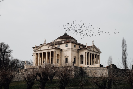
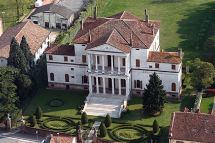
La Rotonda
A La Rotonda la visite en octubre del 2018, en mi viaje a Vicenza de 10 dias, de la mano imprescindible de mi guía Chiara Pesavento (se las recomiendo especialmente chiara.pesavento77@gmail.com). Me hace anticipar el viaje, comenzar buscando información, leyendo pero mucho preguntando, no todos los dias se pueden visitar obras, y una planificación es imprescindibles, asi como recorridos que permitan unir direcciónes cercanas.
En mi cuaderno de viaje de mas de 70 páginas escribi el 12 de octubre de 2018: “…Una hora 50 separa el mundo del modernismo catalán de finales del XIX y principios del XX, de los años del renacimiento (período de transición entre la edad media y los inicios de la edad moderna o entre el descubrimiento de America en 1492 y la revolución francesa en 1789, otros mencionan la caída de Constantinopla en 1453 o la invención de la imprenta en 1440 con Johannes Gutenberg, bueno por ahí andará).
Hacia 1519 muere Leonardo da Vinci, y en 1564 Miguel Angel Buonarroti, faltaba aun un siglo y medio para que la música tonal de Johann Sebastian Bach (1685 – 1750) reemplazara a la de Giovanni Pierluigi da Palestrina (1525 – 1594).
“Una adhesión a una cultura que reinterpretó la arquitectura romana antigua, Andrea di Pietro, no fue sino a sus 30 años, que junto a su benefactor e ideólogo el noble Giangiorgio Trissino quien imaginó las bases de una nueva arquitectura, es decir una arquitectura de una calidad increíble.
No copió, no trasladó, reinterpretó y propuso un nuevo orden, un lenguaje que la sociedad de la época asumió”.
En ese viaje, estudié y señalé 45 obras de Palladio y otros arquitectos para ver, de las que visitamos unas 25.
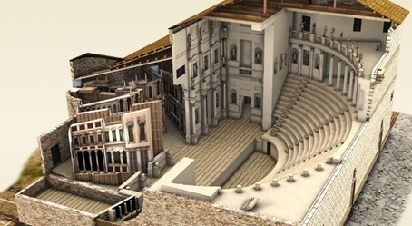
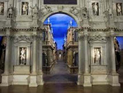
Puede escuchar un concierto en el Teatro Olímpico, primer teatro techado del mundo, y el maravilloso escenario de calles fugadas como si de Tebas se tratase.
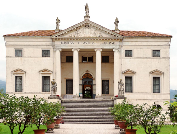
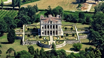
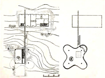
Fuimos a ver de los arquitectos Ottavio Bertotti Scamozzi (1719 – 1790) y Francesco Muttoni (1669 – 1747) su Villa Capra en Saracedo, donde “según dicen”, han mejorado la Rotonda (Villa Almerico, Villa Capra o Villa Capra-Valmarana).
No lo vi así, 3 integrantes de la familia propietaria, te vendían las entradas, y prácticamente solos la recorrimos durante un par de horas. En el tímpano pone Horativs Clavdius Capra (Horacio Claudio Capra) se refiere al Conde “para gloria de él y su familia”.
El Conde Capra vendió el pueblo y la villa a Giuseppe Bassani en 1850, familiar por tercera generación de Bruno Fortunato, el actual propietario. La Villa Capra, esta sobre la via Villa Capra, 39, luego de un cerco de madera, se llega a la villa por una avenida, que va subiendo. Está en Cavallino, comuna de Sarcedo, a 22 km de Vicenza, unos 31 minutos conduciendo (¡¡ponen muchas multas en Italia por la velocidad, pague varias, ojo!!, y te llegan o las paga la compañía del alquiler del auto y te las cargan.
La formación intelectual de Palladio, no solo se debió a su mecenas, y a los viajes que realizó, del cardenal Federico Cornaro y de Bárbaro recibió lecciones sobre la antigüedad a través de las traducciones de Vitruvio (c. 80 o 70 a.C. – c. 15 a.C.)o Marco Vitruvio Polión y sus tratados.
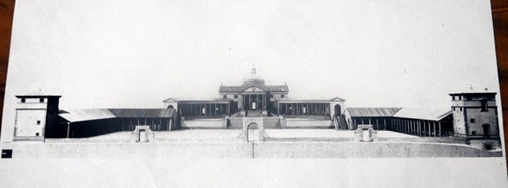
Palladio realiza a Federico Cornaro en el Municipio de Piombo, a 30 km de Venecia, una Villa renacentista que lleva el nombre de Villa Cornaro. Se comenzó en 1553, posee un extraordinario pronaos de doble orden (pórtico y logia central). (6)
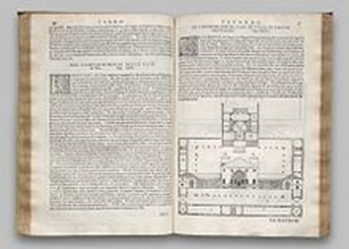
Las opiniones de Palladio forman parte de su tratado “Los Cuatro Libros”, que tienen su base en las mediciones y registros de la arquitectura de la antigüedad. Ello le permitió evitar una imitación, sino materializar una continuidad. Incorpora su obra descrita y analizada, la que constituye un cuerpo teórico que parte de la práctica. (7)
Y quien era Giangorgio Trissino? pertenecía a una familia noble, poderosa e influyente, desde joven realizó tareas diplomáticas al servicio de 3 papas León X, Clemente VII y Paulo III. Viajó por toda Italia, además de Dinamarca y Alemania.y estudió griego en Milán, filosofía en Ferrara. Sus maestros fueron Demetrio Calcocondilas (8) (1423 – 1511) y Niccolò da Lonigo (1428 – 1514).

Tanto Calcondilas como Lonigo supieron inculcarle un amor profundo a los clásicos grecolatinos y en especial por la lengua griega.
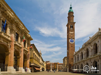
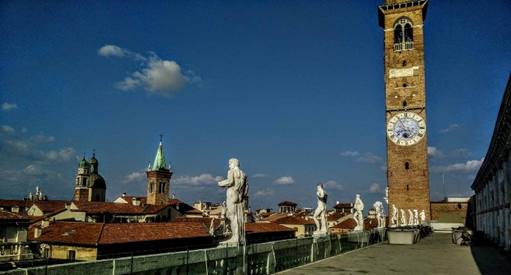
En sus paseos, Andrea atravesaba la Piazza dei Signori, donde estaba el viejo Palazzo della Ragione, construido en el siglo XV, en cuyo segundo piso estaba el gobierno de la ciudad, e iba de compras a la zona comercial de la planta baja, con grandes ofertas de libros, sedas, joyas y objetos textiles.
Los X libros de la arquitectura de Marco Polión Vitruvio, traducido y comentado por monseñor Daniele Barbaro elegido patriarca de Aquileggia. con ilustraciones de Andrea Palladio y otras atribuidas a Giuseppe Salviati (1520 – 1575). Fue editado por Francesco Marcolini da Forli (1500 – 1559), y publicado en Venecia en 1556. Está impreso con ilustraciones xilográficas. 37,6 x 28,2 x 3,1 cm.
Años más tarde y a raíz de un derrumbe parcial de la Basílica, que estaba en un edificio gótico medieval, se llamó a concurso, como indicaba la costumbre, para que los mejores arquitectos hicieran sus propuestas.
Se presentaron arquitectos de reconocida fama como Sebastiano Serlio (1475 – c. 1554) o Jacopo d’Antonio Sansovino (1486 – 1570).
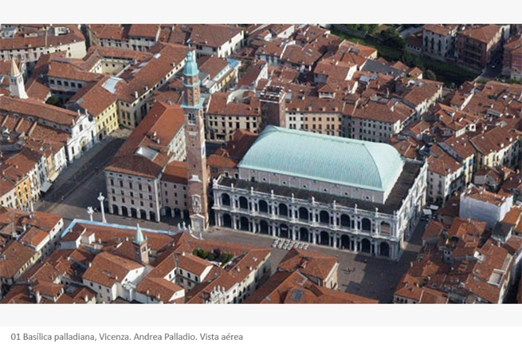
Se impuso la propuesta de Palladio, proponiendo una Logia del Palacio della Raggione, proponía agregar al edificio una basílica, entendida al modo romano, un lugar de reunión y lonja de negocios, al que agregó un pórtico clásico en la fachada principal que da la Piazza delle Erbe, envolviendo todo en “un cascarón” de mármol blanco”.
Se le pidió un modelo de madera, el cual estuvo expuesto para recibir la aprobación pública, durante tres años. El 1550 se empezó la obra. Palladio en su “Tratado”, dice: “La basílica de Vicenza fue construida según mi fantasía y de acuerdo con mis dibujos. Es original por su disposición y formas graciosas”.
En una segunda piel o fachada utilizó un recurso muy novedoso, no utilizado por el mundo clásico, la “ventana palladiana, ventana serlina o ventana véneta”.
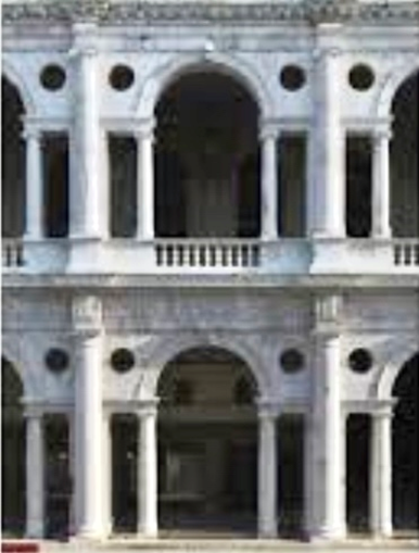
Adosando al lateral de cada arco, una pequeña ventana rectangular que enfatiza el espacio central, ocupado por un arco, a la manera de los arcos de triunfo.
Este elemento arquitectónico sería utilizado en todo el mundo, especialmente España, América e Inglaterra además de sus territorios de influencia.
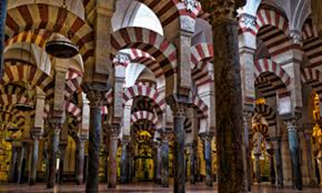
El piso bajo de la Basílica está rodeado de una severa columnata dórica. El principal ya es de orden jónico. En los intercolumnios hay arcos contenidos por columnas menores.
Notas
1
Gian Giorgio Trissino dal Vello d’Oro (Vicenza 1478 – 1550 Roma) fue un poeta, humanista, dramaturgo, filólogo y diplomático del Renacimiento italiano. Propugnó tanto en su famosa Poética de 1529, como en su práctica literaria (su “tragedia Sofonisba” de 1524) seguir las tres unidades aristotélicas: la vuelta a los modelos formales clásicos grecolatinos en temas, estilo, lenguaje y géneros literarios.
2
Datos y referencias de. Descubrir el arte, por Carmen del Vando Blanco 8 de abril de 2018. The Architects newspaper, por Drew Zelba 17 de mayo 2019
3
El documental, dirigido por Giacomo Gatti (autor también de Miguel Ángel, el corazón y la piedra), pone pie en la región del Véneto, cuna de Palladio, y en las Villas que proyectara para las prestigiosas familias del siglo XVI, Palacio Chieracati, Teatro Olímpico, Basílica Palladiana, La Rotonda, Villa Saraceno, Villa Caldogno y Villa Godi Malinverni.
Gatti continúa en Roma con el Panteón que tanto inspiró a Palladio hasta tal punto que su cúpula de hormigón artesonado (hemisférica), llegó a ser un elemento característico de las villas palladianas.
La filmación finaliza en los Estados Unidos, con Wall Street y la Casa Blanca, construidas siguiendo la estela de Palladio hace cuatrocientos cincuenta años.
4
Motovum Group Association (MGA) fundada en 1977 es una comunidad mundial de editores y especialistas en libros, entre ellos fotografos, traductores, diseñadores, comprometidos en fomentar la cooperación y el entendimiento internacional mediante el intercambio de ideas e información. La ciudad de Motovum, en Croacia, fundada en 983 por Otto II en el centro de la Península de Istria fue bastión del Sacro Imperio Romano. Su campanario fue construido en el siglo XIII, un ejemplo de arquitectura colonial veneciana.
Antiguo Castro Romano, o «castrum», que era como los romanos llamaban a los poblados o a las fortificaciones, que en la cima de una colina estaba rodeada de una muralla circular. Motovun tuvo su mayor expansión bajo la dominación veneciana; sus murallas circulares a dos alturas con torres y puertas se construyeron entre los siglos XIV y XVII. Pero, como en toda Istria, las epidemias de peste causaron grandes estragos. Para evitar el contagio, el Senado veneciano puso diez personas para montar la guardia en la ciudadela y autorizo al alcalde a dormir fuera de los muros del pueblo.
Las tres partes de la ciudad están conectadas por un sistema de fortificaciones internas y externas con torres y puertas de la ciudad con elementos de estilos románico, gótico y renacentista, construido entre los siglos 14 y 17. Con el MGA, he viajado a la India, Venecia, Dresden, Jaranilla de la Vega, Chioggia, Placencia, entre otros, donde hemos organizado conferencias, visitas a lugare especialmente interesantes para los editores, y realizado acuerdos de coedición
5
Vincenzo Scamozzi, el célebre arquitecto que más de un siglo antes, en 1616 había concertado un legado para permitir a un joven de Vicenza estudiar arquitectura siempre que llevara su apellido. Apoyado por el marqués Capra, Bertotti obtuvo el legado en una fecha que sería antes de 1761.
Traigo este texto de Francesco Milizia
“…Vincenzo Scamozzi, arquitecto de primera, al no tener parientes cercanos, dispuso de su patrimonio de tal manera que cualquiera de su patria que alcanzara la mayor excelencia en Arquitectura pudiera disfrutarlo de por vida, con la obligación de asumirlo. el apellido del benefactor… Ottavio Bertotti, se convirtió en Scamozzi a juicio de los albaceas, los marqueses Capra…. Pero Vicenzo Scamozzi nunca hubiera esperado que su beneficiario Ottavio Bertotti Scamozzi… se hiciera famoso celebrando aún más la gloria de Palladio”.
“… Ottavio Bertotti Scamozzi, después de examinar, comparar y medir exactamente las obras de Palladio, separándolas de las atribuidas a otros les dio una edición magnífica, que honra a los artistas de Vicenza y de toda Italia”.
“Memorias de arquitectos antiguos y modernos”, Imprenta Real, 1781.
6
Dirección Via Roma 104 – Piombino Dese (PD). Iniciada en 1552 y finalizada 1553. Visitas en verano sábado de 15:30 a 18:00 hs. Grupos reserva previa en el Caffe Palladio 049 9365017.
7
Taller UNO, Facultad de arquitectura y Urbanismo. UNLP. La Plata Argentina Arq. Pablo Szelagowski, Pablo Remes Lenicov, María Luisa Sagués.
8
Renacimiento nórdico es un término de la historiografía del arte utilizado para clasificar y describir el Renacimiento europeo al norte de los Alpes, fuera de Italia y con exclusión del renacimiento español.
9
La empresa Magnitudofilm ha realizado los documentales dedicados a Caravaggio, El alma y la sangre y a Bernini y al proyecto cinematográfico “Palladio, el poder de una arquitectura”.
Personajes. Por orden de aparición
– Pietro de la Góndola (Andrea Palladio)
– Giovanni Maria Falconetto. Arquitecto y pintor (Verona, 1458 – 1535 Padua)
– Gian Giorgio Trissino dal Vello d’Oro (Vicenza, 8 de julio de 1478 – 1550 del 8 diciembre Roma,) fue un poeta, humanista, dramaturgo, filólogo y diplomático del Renacimiento italiano.
– Donato di Pascuccio d’Antonio o Donato di Angelo di Antonio, conocido como Bramante (Fermignano c.1443/1444 – 1514 Roma), pintor y arquitecto italiano, que introdujo el estilo del primer Renacimiento en Milán y el “Alto Renacimiento” en Roma. Su obra más famosa fue el planeamiento de la Basílica de San Pedro.
– Leon Battista Alberti (Génova 18 de febrero de 1404 – 1472 del 25 de abril Roma) fue arquitecto, secretario personal (abreviador apostólico) de tres papas (Eugenio IV, Nicolás V y Pío II), humanista, tratadista, matemático y poeta italiano. También fue criptógrafo, lingüista, filósofo, músico y arqueólogo. Sin duda uno de los humanistas más polifacéticos e importantes del Renacimiento.
– Vitruvio o Marco Vitruvio Polión (c. 80 ó 70 – 15 a. C.) fue un arquitecto, escritor, ingeniero y tratadista romano del siglo i a. C. Fue arquitecto de Julio César durante su juventud y al retirarse del servicio, entró en la arquitectura civil, siendo de este periodo su única obra conocida, la basílica de Fanum (Italia). Es el autor del tratado más antiguo sobre arquitectura que se conserva y el único de la Antigüedad clásica, De Architectura, en diez libros (probablemente escrito entre los años 27 a. C. y 23 a. C.). Inspirada en teóricos helenísticos –se refiere expresamente a inventos del gran Ctesibio–, la obra trata sobre órdenes, materiales, técnicas decorativas, construcción, tipos de edificios, hidráulica, colores, mecánica y gnomónica (Libro IX).
– Demetrio Calcocondilas Chalkokondyles o Calcocondilo (Atenas agosto de 1423 . 1511 9 de enero de 1511 en Milan) fue un escritor, profesor y gramático griego. Contribuyó al Renacimiento de la literatura griega en Italia. Fue el autor de Erotemata (1493), una celebrada gramática griega, y produjo las primeras ediciones impresas de las obras de Homero (1488) y de Isócrates (1493).
– Niccolò da Lonigo o Leoniceno o afrancesado como Nicolas Léonicène (Lonigo, Vicenza en el Véneto 1428 – 1524 el 5 de junio en Ferrara) fue un célebre médico, helenista, humanista, linguista y botánico italiano. Discípulo del humanista Ognibene Bonisoli (1412 – 1474), con quien aprendió griego. Se graduó en Medicina en la Universidad de Padua en 1453, enseñó filosofía natural y aplicó la filología científica a los textos clásicos, latinos y griegos. El filósofo y teólogo considerado como uno de los más grandes eruditos del Renacimiento Nórdico (8) Erasmo de Roterdam (1466 – 1536) admiró su erudición.
– Erasmo de Róterdam (en neerlandés: Desiderius Erasmus van Rotterdam), (Róterdam o Gouda 28 de octubre de 1466 – 1536 el 12 de julio en Basilea). fue un filósofo humanista, filólogo y teólogo cristiano neerlandés, considerado como uno de los más grandes eruditos del Renacimiento nórdico.
– Daniele Matteo Alvise Barbaro (Venecia 8 de febrero 1514 – 1570 13 de abril Ibid.). Patriarca católico llegó a ser cardenal, humanista. estudioso de filosofía, matemática y óptica.
Conocido como traductor y comentarista del tratado De architectura de Vitruvio y por el tratado de La pratica della perspettiva.
Realizó estudios sobre la perspectiva y su aplicación en la cámara oscura. Hombre culto y de amplios intereses, fue amigo de Andrea Palladio, Torquato Tasso (1544 – 1595) y Pietro Bembo. Encargó a Palladio la Villa Barbaro, en Maser, y a Paolo Veronese (1528 – 1588) numerosas obras, incluyendo dos de sus retratos.
– Paolo Caliari o Cagliari, tambien conocido como Paolo Veronese (Verona 1528 – 1588 Venecia). Hijo de un picapedrero, su nombre lo toma de su ciudad natal, Verona. Pintor, es una figura central del Manierismo veneciano. Son especialmente famosos sus grandes cuadros de fiestas bíblicas, repletos de figuras, pintados para los refectorios de monasterios de Venecia y Verona, y también fue el principal pintor veneciano de techos. La mayoría de estas obras permanecen in situ, o al menos en Venecia, y su representación en la mayoría de los museos se compone principalmente de obras más pequeñas, como retratos. Muchos de los más grandes artistas se cuentan entre sus admiradores, Rubens, Watteau, Tiepolo, Delacroix, y Renoir».
– Torquato Tasso (Sorrento, Nápoles, 11 de marzo de 1544 – 1595 25 de abril Roma). Poeta italiano de la época de la Contrarreforma, conocido por su extenso poema épico Jerusalén liberada, ambientado en el asedio de Jerusalén durante la Primera Cruzada, así como por la locura que le aquejó en sus últimos años. Considerado uno de los cuatro grandes poetas de Italia.
– Sebastiano Serlio (Bolonia, 6 de septiembre de 1475 – c. 1554 Fontainebleau) fue un arquitecto manierista italiano que formó parte del equipo que construyó el palacio de Fontainebleau. Ayudó a clasificar los órdenes clásicos de la arquitectura gracias a su tratado “Tutte l’opere d’architettura et prospettiva”, una de las obras teóricas fundamentales de la arquitectura durante la Edad Moderna.
– Jacopo d’Antonio Sansovino (Florencia 2 de julio de 1486 – 1570 27 de noviembre en Venecia). Arquitecto y escultor renacentista, conocido por sus obras en la Plaza de San Marcos en Venecia. Andrea Palladio, en el Prefacio de sus Quattro Libri, opinaba que la Biblioteca Marciana de Sansovino era el mejor edificio erigido desde la Antigüedad. La Vita de Sansovino es la única de las escritas por Giorgio Vasari que imprimió separadamente.
– Ottavio Bertotti Scamozzi (Vicenza 1719 – 1790 Ibid.), recibe el legado de Vicenzo Scamozi y su apellido, son famosos por su alta calidad los dibujos de las obras de Palladio. Autor del libro “Le fabbriche e i disegni di Andrea Palladio”.
– Marco Vipsanio Agripa (c.63 a.C – 12 a,C,) fue un importgante general y político romano. Amigo íntimo, colaborador, general y encargado de los asuntos militares de Octavio, el futuro emperador César Augusto. Agripa fue el responsable de muchos de los éxitos militares de aquél. Tuvo a su cargo las reparaciones y mejoras de Roma, el acueducto conocido como Aqua Marcia, y las canalizaciones para abastecer a la ciudad. En el 33 a.C. fue elegido edil, reparo calles, limpio e incementó la Cloaca Máxima, realizó jardines, pórticos y termas, una de las cuales lleva su nombre, Las Termas de Agripa. Augusto encantado con las obras dijo «me he encontrado una ciudad de ladrillo y he dejado una de marmol». he aqui su gran reconocimiento a Agripa.
– Publio Elio Adriano (Itálica o Roma 24 de enero de 76 – 138 10 de julio Bayas). Quiza nació en la ciudad de Hispania Baetica, actual termino municipal de Santiponce en Sevilla, España. Durante su reinado fue conocido como «Imperator Caesar Divi Traiani filius Traianus Hadrianus Augustus, y Divus Hadrianus«. Emperador del Imperio Romano desde el 117 al 138, Culto se destacó por su aficción a la filosofia estoica y epicúrea. Trajano lo prefirio como heredero, le concedió la mano de Pompeya Plotina, ésta junto a Lucio Licino Sura fueron determinantes en su ascenso al trono, en agosto del año 117. Ilustre militar, experto en asuntos bélicos, exccelente administrador y reformador del sistema financiero por conquistas, defensa de las fronteras, mejora de las relaciones diplomaticas con otras naciones paa crear zonas de influencias. Fomento politicas de tolerancia, especialmente los cristianos, mejorando las relaciones con Grecia, y normalizó la situación de los esclavos que eran torturados o asesinados ante un delito contra el dominus, bien de la persona que era propietaria y tenía el derecho sobre una cosa corpórea, con pleno poder sobre ella.
–Apolodoro de Damasco (Damsco c. 60 – 133) fue uno de los más grandes arquitecto e ingeniero de la Antigua Roma de origen sirio-romano (ascendencia griega), conocido con los sobrenombres el Damasceno y el Mecánico. Diseñó monumentales obras para el emperador Trajano, como el Puente de Trajano sobre el río Danubio en el año 104. los mercados del Quirinal en Roma, las Termas y el Foro de Trajano, que incluye la basílica Ulpia, el mercado de Trajano, además de puertos, arcos triunfales y otras obras públicas. Una de sus obras más conocidas es la imponente columna de Trajano, estructura de treinta metros de altura y cuatro metros de diámetro, completamente tallada, que narra la historia de la victoria de Trajano en la guerra contra los dacios.
La columna se inauguró en el año 113. Construida en mármol, en la cúspide se encontraba una estatua en hierro de Trajano. Algunos señalan que se trataba de un águila, símbolo de Roma, pero actualmente muestra una estatua de san Pedro. Se le atribuye el panteón de Agripa, una de las pocas muestras de arquitectura de la Antigua Roma cuya estructura todavía se conserva en buen estado.
–Iñigo Jones (Londres 1573 – 1652 Ibid) arquitecto inglés. al ser nombrado «surveyor» del príncipe de Gales, pasó al servicio de lord Arundel. Entre sus obras mas importantes podemos mencionar Queen’s House de Greenwich (1616-1618 y 1629-1635), la capilla de Somerset House (1638), destruida en 1775, la Queen’s Chapel de Saint James Palace (1623-1627) donde utiliza motivos serlianos, el Castle Ashly y su obra maestra, la Banqueting House de Whitehall (1619-1622) donde se relaciona directamente con Palladio, Jones pretendía que la obra pareciera un trozo de la antigua Roma trasladado a Whitehall, lo ha conseguido.
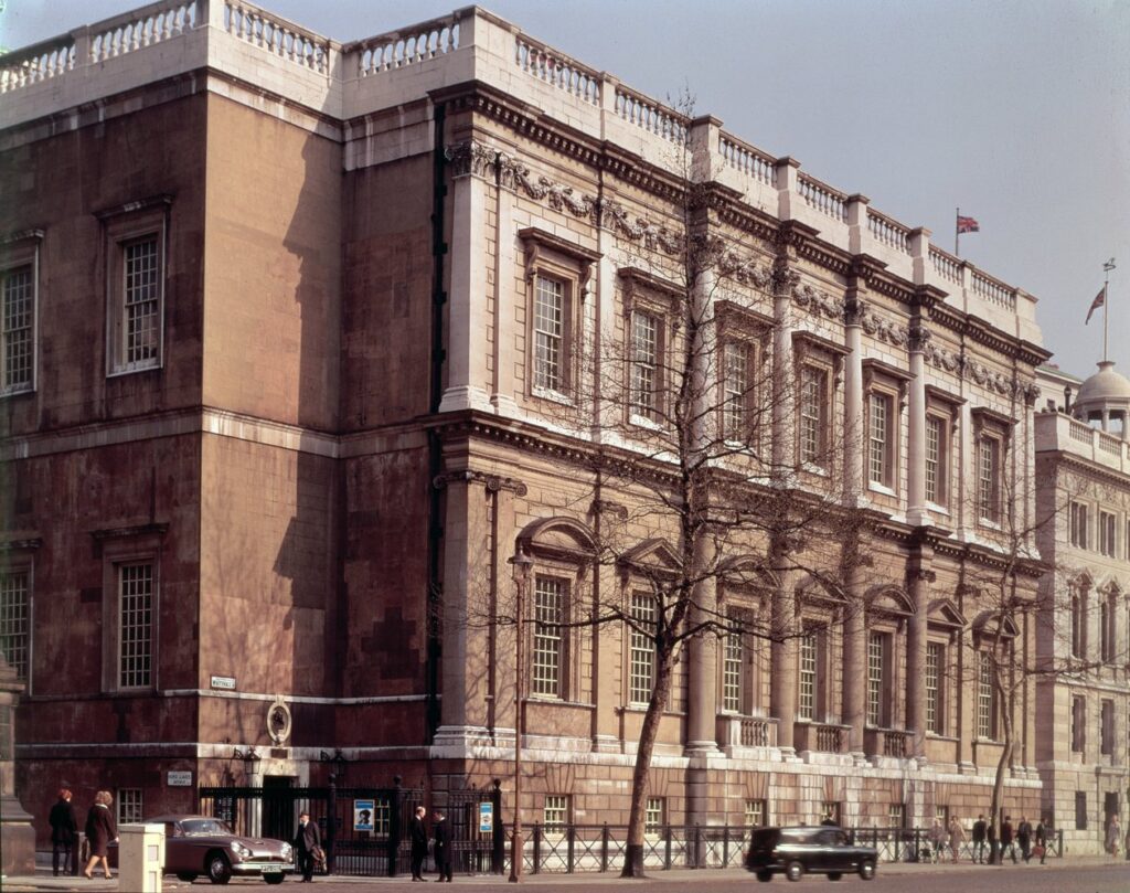
Con Inigo Jones, comienza una influencia en el arte de Inglaterra durante más de dos siglos. Junto con Christopher Wren, Inigo Jones fue el arquitecto que configuró la arquitectura británica del siglo XVII. sus propuestas de un clasicismo diferente hace apartar el gótico tardío que perdura en el arte inglés en las primeras décadas del siglo XVII y del modelo del barroco italiano. Con un gran conocimeinto introdujo las fórmulas del Renacimiento italiano, en especial las derivadas de Palladio, en la arquitectura inglesa. Realiza un primer viaje a Italia alrededor de 1596, años mas tarde en el 1613 vuelve a Italia con el grupo del coleccionista Arundel. Se quedan 1 año para estudiar la obra de Andrea Palladio, conocer su tratado –Los cuatro libros de arquitectura (1570)- y observar las ruinas romanas.


